What is Subpage?
Subpage acts as a form array where users can add multiple entries of the same structure. Each entry contains multiple sub-components (input fields, selects, photos, etc.) that you configure in the Flow Builder. Use Cases:- Multi-recipient deliveries: Capture name, phone, signature for each recipient
- Item inspection: Record condition, photos, notes for each item
- Proof of delivery: Collect signature + photo + feedback from multiple parties
- Service checkpoints: Document multiple inspection points with photos and readings
Allowed Sub-Components
Subpage can contain only these seven component types:- View - Display-only fields (labels, instructions, calculated values)
- Input - All input types (String, Numeric, Date, Datetime, Time, Address, Geolocation, PhoneNumber, URL, Currency)
- Select - Dropdown, checkbox, or button selection (single or multi-select)
- Photo - Image capture with watermark and gallery options
- Signature - Digital signature capture
- List - Repeatable item list (text / checkbox / quantity types)
- Bill - Line-item billing with master items (name + unit price) and master costs (surcharge / discount)
How to Configure Subpage
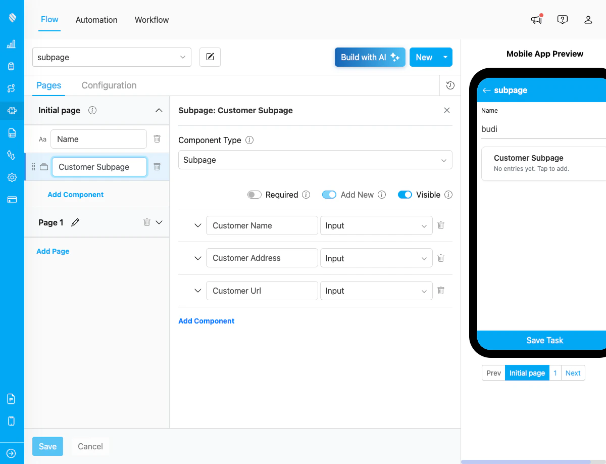
Subpage component configuration in Flow Builder showing Customer Subpage with three sub-components
Step 1: Add Subpage Component
In the Flow Builder, drag the Subpage component from the component list to your page.Step 2: Configure Subpage Properties
Configure the basic properties of the Subpage:- Title: Name of the subpage (e.g., “Delivery Recipients”)
- Required: Toggle whether at least one entry must be added
- Visible: Toggle visibility on the mobile app
Step 3: Add Sub-Components
Click “Add Component” inside the Subpage to add fields. Each sub-component has:- Title: Field label displayed to users
- Component Type: Choose from view, input, select, photo, signature, list, or bill
- Type (for specific components): Additional type selection (e.g., String, Numeric for Input)
- Required: Whether the field must be filled
- Visible: Whether the field is displayed
- Default Value: Pre-filled value (optional)
Step 4: Configure Component-Specific Settings
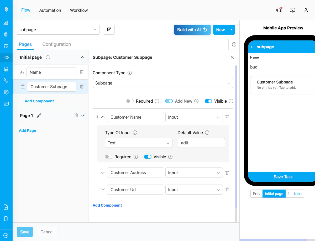
Expanded view of a sub-component showing detailed configuration options including Type, Default Value, Required, and Visible settings
- String: Set default text value
- Numeric: Add min/max values and units (e.g., KG, M3)
- Date: Set default date value
- Datetime: Set default datetime value
- Time: Set default time value
- Address: Multi-line text area with default value
- Geolocation: Enable map picker for coordinates, geolock with radius settings
- PhoneNumber: Set default phone number value
- URL: Set default URL value with validation
- Currency: Set default currency value with formatting
- Options: List of selectable options
- Min/Max: Selection constraints for multi-select
- Type: Dropdown, Checkbox, or Button display
- Min/Max: Number of required/allowed photos (0-10+)
- Watermark: Enable watermark on photos
- Select Gallery: Allow selection from device gallery
- Required: Whether signature must be captured
- Master Items: Configure item names and unit prices that users can select at task time
- Master Costs: Configure surcharges and discounts (name, type, amount)
- Required: Whether at least one item must be selected before the entry can be saved
Step 5: Reorder Sub-Components
Drag the grip handle on the left of each sub-component to reorder fields within the Subpage.Validation Rules
Component Level
- Title: Required for each sub-component
- ID: Auto-generated from title, must be unique
- Required Field: Must be marked as required or optional
Subpage Level
- Unique IDs: Sub-component IDs must be unique within the subpage
- Reserved Keys: Cannot use reserved field names (name, flow, hubId, startTime)
- Max ID Length: Generated IDs are limited to 47 characters
Restrictions
- No nested subpages: Cannot add Subpage inside Subpage
- Component types: Only 7 allowed types (view, input, select, photo, signature, list, bill)
- No advanced components: Cannot add subflow, timer, capture, voice, or barcode
- Bill limitation: Bill inside Subpage does not support “Use Data Source” (external data source). Master items and costs must be configured directly in the Flow Builder.
How Subpage Works in Tasks
When field workers use the mobile app or web interface to create/complete tasks:- List View: Shows all entries with completion status (e.g., “3/5 fields completed”)
- Add Entry: Tap ”+ Add” button to create new entry
- Edit Entry: Tap on an entry to open the form
- Complete Fields: Fill in all required fields per entry
- Delete Entry: Remove entries that are no longer needed